For a while the industry treated mobile as an afterthought. Design for desktop, then squeeze it onto a phone.
Our numbers told a different story. A large and growing share of our readers arrived on a phone. Often a modest one. Often over a shaky connection.
The phone was not the secondary experience. It was the experience.
I would check our live analytics from my own phone standing in a queue. The picture was always the same. A day’s traffic split across Google, Facebook, direct visits and a syndication partner like telegrafi.com. And most of those people were reading on the exact device I was holding.
You cannot look at that every day and still believe the desktop layout is the “real” site.
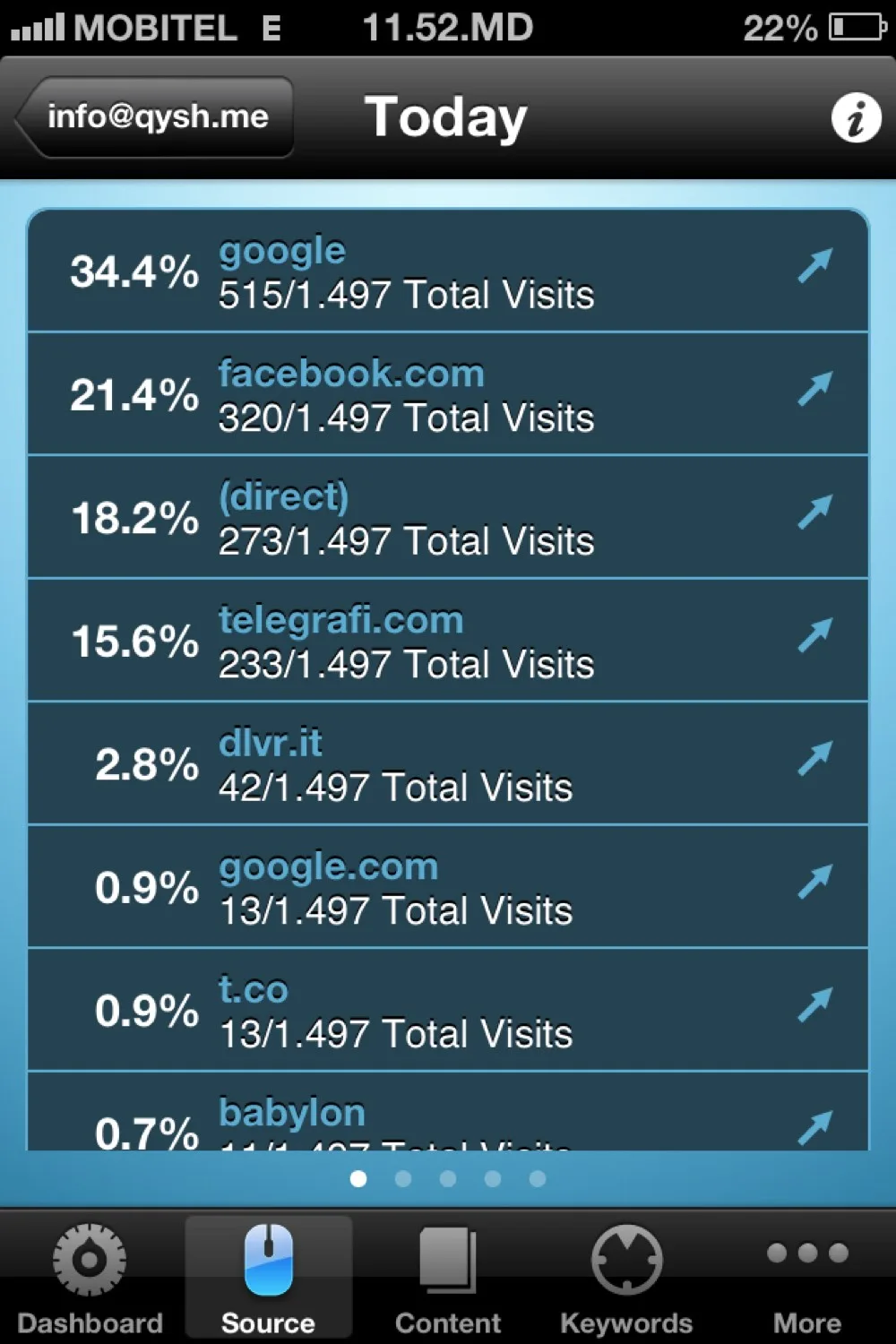
So we designed for it first and let the desktop version follow.
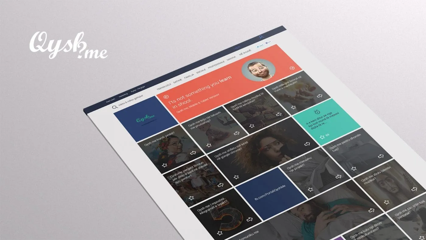
That mockup is where phone-first thinking became visible. We dropped the busy magazine grid for a calm layout of tiles. Each one a single question. Each one sized to be tapped.
It reads almost like an app. That was the point. By then a real chunk of our readers only ever met Qysh Me on a phone.
What designing phone-first forced us to do
A small screen and a slow connection is a constraint. Constraints make you honest.
With a narrow column and a reader in a hurry, you cannot hide behind clutter.
- Ruthless hierarchy. The answer to the question came first. Everything else moved down or out.
- Readable type. Comfortable text and generous spacing, so a how-to was easy to follow on a small screen.
- Tap-friendly everything. Buttons and links sized for thumbs, not mouse pointers.
- Light pages. Fewer heavy elements, because every extra kilobyte was a reader lost on a slow connection.
- Single-column simplicity. Layouts that reflowed cleanly instead of breaking.
The constraint improved desktop too
Here is what I did not expect. Stripping a page down to what a phone reader truly needed did not only help on mobile.
It made the desktop version clearer as well. Once we had decided what mattered most on a small screen, the larger layout became calmer and more focused by default.
What I recommend
Design for your hardest case, not your most comfortable one.
If a meaningful share of your audience is on phones and slow connections, start there. Let everything else inherit that discipline.
On Qysh Me, phone-first was not a limitation we tolerated. It was the decision that made the product simpler and better for everyone. It still shapes how I approach design.
Write a comment